The Page Between Pages: Tan Mu's Web and the Architecture of Attention
The average attention span on a single browser tab is measured in seconds. Researchers who track eye movement across screens have found that most users switch between tabs every twelve to twenty seconds, and the more tabs are open, the shorter the dwell time on each one becomes. A browser window, with its address bar, its bookmarks, its cascading rectangles of content, is no longer a frame for a single document. It is a command center for divided attention, a visual environment in which the user never fully arrives at any destination before another destination announces itself. The browser tab was invented in 2000, and within two decades the average number of tabs open during a single session rose to between ten and twenty, each one a small rectangle of partially loaded content vying for a fraction of the viewer's attention. What was once a tool for navigating between documents has become a document in itself: a composite image of overlapping priorities, half-read articles, paused videos, abandoned searches, and the persistent sense that somewhere in the next tab, something more important is waiting.
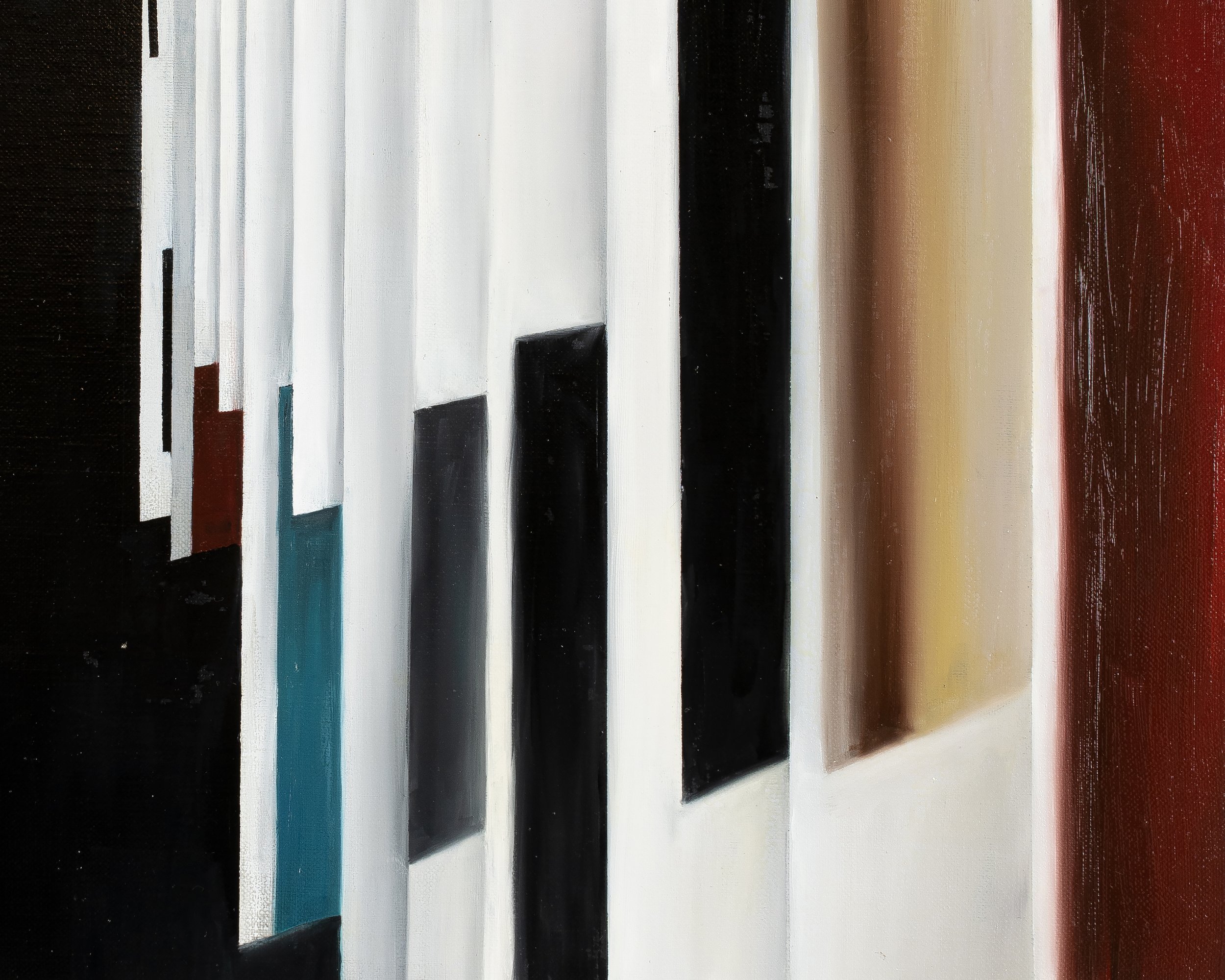
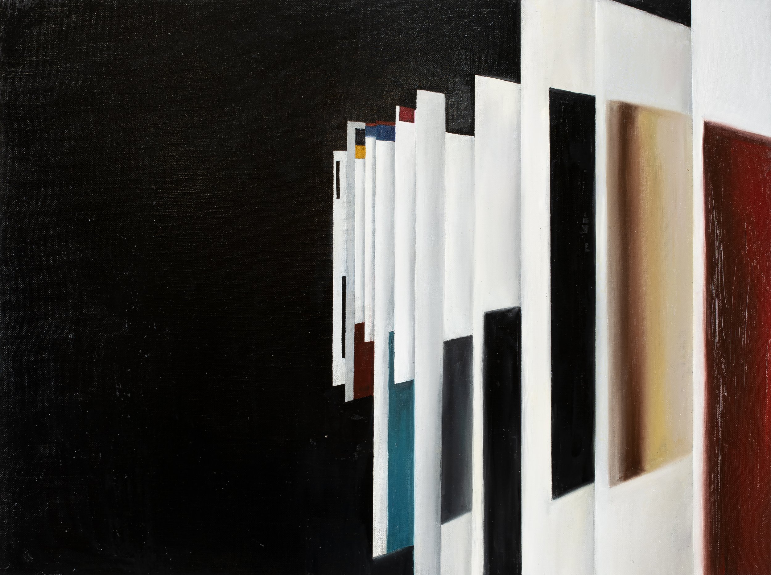
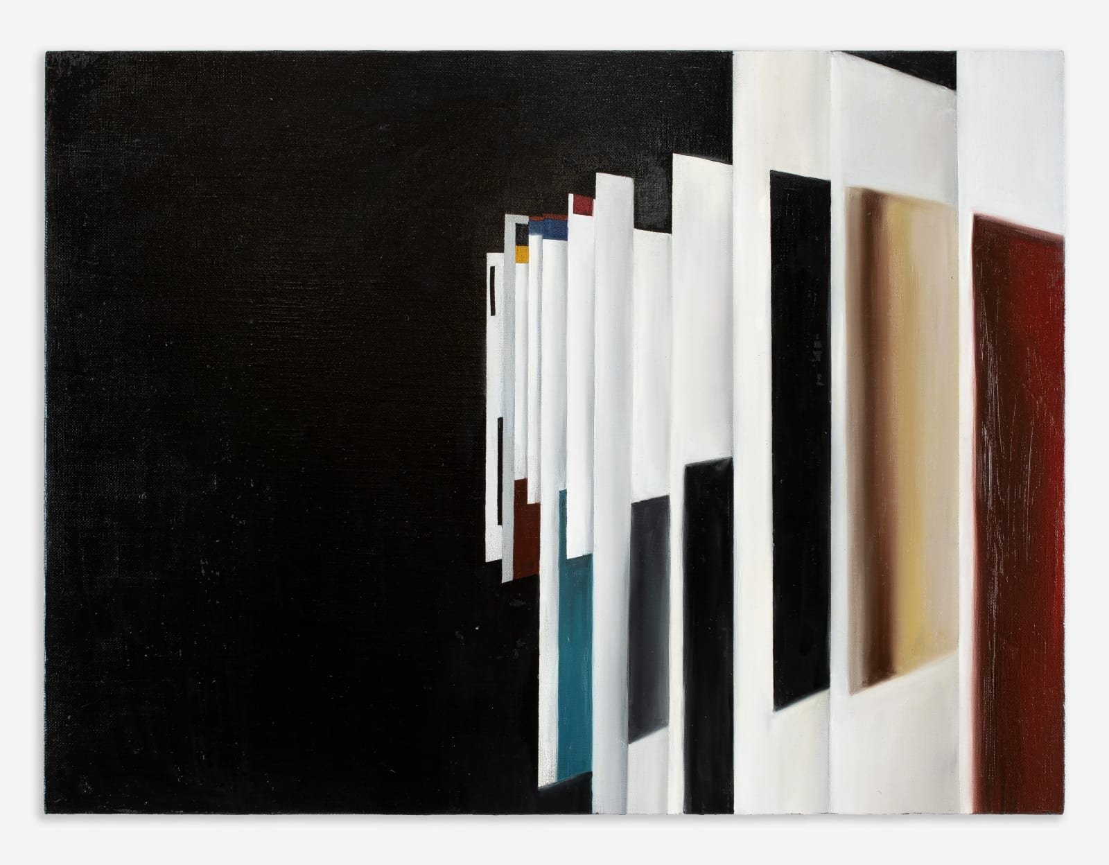
Tan Mu painted Web in 2021. Oil on linen, 45.7 by 61 centimeters, a modest horizontal format that accommodates the composition's spread of rectangular forms across a black ground. The painting depicts the transitional moment when a browser shifts from one page to another: overlapping windows, each one a rectangle of color or partial content, floating against the deep black of empty screen space. These rectangles contain no legible text. They contain color. Bands of blue, red, orange, green, and white define the edges and interiors of each floating panel, and the panels overlap and interleave in a way that mirrors the spatial logic of a browser with multiple windows open, some partially obscured by others, some fully visible, some reduced to a sliver of color at the margin where one rectangle meets another. The painting is not a screenshot. It is a translation of the browsing experience into the language of oil paint, and in that translation, something decisive happens: the content disappears, and what remains is the structure of attention itself, the geometry of the interface, the way that digital experience arrives not as a single image but as a stack of overlapping frames, each one competing for the eye.
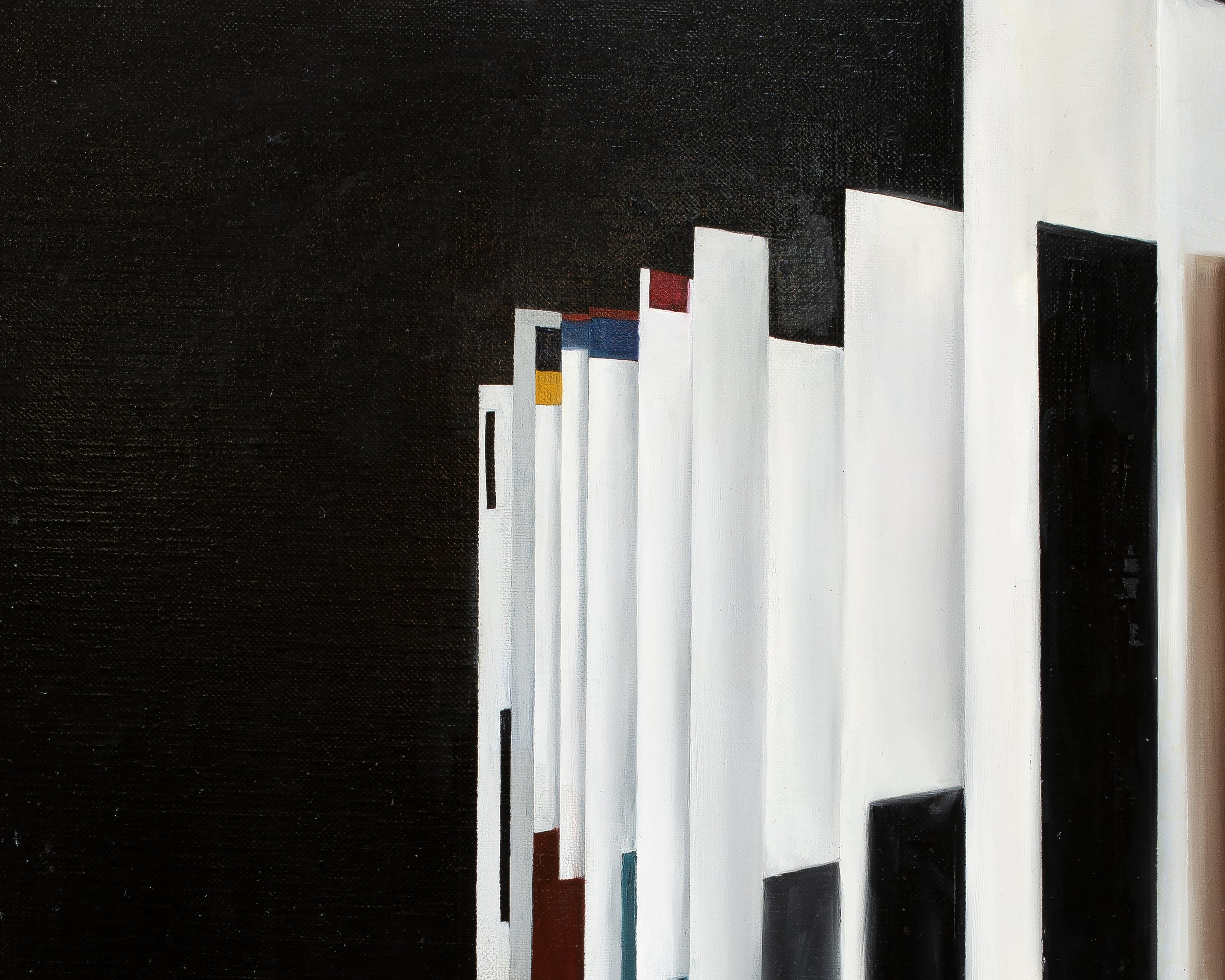
The linen is 18 by 24 inches, a size that requires the viewer to approach closely, close enough to see the weave of the fabric showing through the paint in the black ground areas where the oil has been applied thinly, almost as a stain rather than a coat. At arm's length, these thin passages reveal the diagonal hatching of the linen underneath, a material fact that grounds the digital subject in the physical substrate of painting. The black ground is not a flat black. It is built from layers of dark pigment that vary in temperature across the surface: cooler in the upper register, where the deepest black suggests the void of an empty screen; slightly warmer where it meets the edges of the floating panels, as if the color blocks bleed their chroma into the darkness that surrounds them. The floating rectangles are rendered with a precision that shifts depending on the viewing distance. From two meters, the panels appear crisp, their edges as sharp as the borders of a browser window. At thirty centimeters, the edges reveal themselves as painted, each one the result of a brushstroke that followed a straight edge or a line drawn in pencil under the paint, and the colors that appeared solid from across the room separate into thin layers of translucent oil, each one a decision about opacity and saturation that the viewer can reconstruct by looking closely at where one color meets another.
The color palette is restricted but not austere. Red appears in two distinct registers: a warm, almost cadmium red that fills one of the larger floating panels, and a darker, more brownish red that occupies a narrower rectangle partially hidden behind another panel. Blue operates similarly: a bright, saturated blue defines the header area of one panel, while a darker, cooler blue appears as a border or accent bar along the edge of another. Orange, green, and white appear as accent colors, thin strips that suggest the colored borders, progress bars, and highlight bands of a graphical user interface without reproducing any specific one. Tan Mu has described the process by which these panels arrived at their current form: "At first, I included multiple overlapping elements such as news articles, advertisements, and recognizable media logos. Over time, I chose to simplify these details. I transformed text and logos into abstract color blocks, allowing the composition to become more universal and less tied to specific sources." The transformation is not simplification in the reductive sense. It is a process of extraction: removing the content while preserving the structure, removing the specific while preserving the general, removing the readable while preserving the legible. The panels in Web do not need to show a headline or a video player to be recognizable as components of a browsing session. Their size, their position, their overlap, and their color are enough. The painting has removed everything that can be read and kept everything that can be recognized, and what remains is the grammar of the interface: the way that rectangles of color, arranged in a layered stack against a dark ground, communicate the experience of being online without showing a single word of content.
Josef Albers spent twenty-seven years producing the series he called Homage to the Square, beginning in 1950 and continuing until his death in 1976. The series comprises over a thousand works in oil, each one composed of three or four nested squares of color on a single panel, the squares sharing a common vertical axis but shifting in their horizontal alignment so that the composition sits higher or lower within the frame, creating the illusion that the colored squares are advancing or receding in space. Albers painted these squares using a palette knife, applying thin layers of unmixed paint directly from the tube onto the white ground of the panel, building the color through superimposition rather than mixing, and he recorded the exact commercial names of the paint tubes he used on the back of each panel, creating an archive so precise that any of the paintings could be reproduced from his notes. The discipline of the format was absolute: every painting in the series uses the same nested square structure, the same proportions, the same orientation, and the same refusal of gesture or brushmark. The only variable is color, and color, in Albers' hands, is never decorative. It is structural. It is the means by which the painting advances and recedes, by which it creates depth on a flat surface, by which it makes the viewer aware that color perception is not fixed but relational, dependent on context, dependent on adjacency, dependent on the colors that surround any given square and the order in which the eye encounters them.
The connection between Albers' Homage to the Square and Tan Mu's Web is not visual in the obvious sense. Albers' paintings are calm, meditative, and slow. Web is compressed, overlapping, and fast. But the structural principle is the same: the color rectangle as the fundamental unit of meaning, and the arrangement of color rectangles as the generator of spatial and perceptual effects that cannot be attributed to any single rectangle alone. In Albers, the nested squares produce the illusion of depth, of one color sitting in front of another or behind another, and the specific character of that illusion changes with every permutation of the palette. In Web, the overlapping panels produce the illusion of a browser window, of one rectangle obscuring another or sitting behind it, and the specific character of that illusion changes with every permutation of color, size, and overlap. Both artists work within a strict rectilinear format. Both use color as the primary carrier of meaning within that format. Both treat the rectangle not as a container for content but as a generator of spatial relationships, and both understand that the spatial relationships generated by color rectangles are not neutral: they carry information about hierarchy, about priority, about what is in front and what is behind, about what demands attention and what recedes into the ground. Albers made this understanding the subject of his entire late career. Tan Mu has made it the subject of a single painting, but the subject is the same: the way that color, arranged in rectangles against a ground, creates the experience of depth, priority, and attention that the viewer learns to navigate without thinking, whether that viewer is looking at a painting on a wall or a browser on a screen.
Tan Mu has stated that Web "captures the moment of a page transition," and she has placed this moment in a sequence of other fleeting instants that define her practice: the moment a water droplet hits a surface in The Splash of a Drop 1, the seconds of a nuclear explosion in Trinity Testing, the instant when a browser shifts from one page to another in Web. "Although these moments are brief," she has written, "their effects extend far beyond the instant itself. They ripple outward, influencing how society develops." The page transition is the briefest of these instants, shorter than the splash of a drop, shorter than the flash of a detonation, a fraction of a second in which one page dissolves and another begins to load, and it is the instant in which the structure of the interface becomes visible because the content of the page is not yet loaded. In that fraction of a second, the browser is not a window onto content. It is a window onto itself. The user sees the frame, the tabs, the loading bar, the empty rectangles where content will appear, and for that brief moment, the architecture of the interface is revealed as what it always was: a system of overlapping frames designed to manage the flow of information, to determine what appears in front and what remains behind, to organize the chaos of the network into a hierarchy of rectangles that the eye can navigate. The page transition is the instant in which the interface is most itself, because it is the instant in which the interface is all there is. No content has arrived yet. Only the frame.
What Tan Mu paints in Web is not the content that will eventually fill these rectangles but the structure of the frame itself, the architecture of attention that the browser imposes on every user who opens it. The painting registers the condition that researchers of digital attention have documented in their eye-tracking studies: the browser is not a neutral tool for viewing content. It is an environment that shapes the way attention is distributed, the way information is prioritized, the way the eye moves across a screen in a pattern that is determined less by the viewer's intentions than by the layout of the interface. The black ground in Web represents what Tan Mu has called "the virtual space of the internet," and the floating panels represent the fragmented pieces of that experience, "both familiar and abstract." But the ground is also doing something more specific. It is the color of the screen before any content has loaded, the color of the browser when it is empty, the color of the void that exists behind every rectangle of information that the user sees. In Silicon (2021) and Logic Circuit (2022), Tan Mu has explored similar compositions of layered elements against dark backgrounds, and the connection she draws between these works is explicit: "This approach connects to earlier works like Silicon and Logic Circuit, where I also explored layered compositions and stark contrasts. The darkness suggests the vastness and complexity of information systems, while the floating pages emphasize the fragmented and temporary nature of digital experience." The darkness is not empty. It is the substrate of information, the ground against which the rectangles of content appear and disappear, the negative space that makes the positive space of the interface legible.
Franz Kline's paintings of the late 1940s and early 1950s are often described as gestural and spontaneous, explosions of black paint on white canvas that seem to record the immediate energy of the painter's arm. This description is wrong. Kline worked from preliminary sketches, often made on the pages of telephone directories, enlarging small compositions to monumental scale using a projector. The resulting paintings, such as Painting No. 2 (1954), now in the Museum of Modern Art, New York, and Mahoning (1956), now in the Whitney Museum of American Art, are architectural in their structure. The black forms do not explode across the canvas. They are built. They interlock. They define and are defined by the white forms that surround them, and the relationship between black and white, between figure and ground, between the painted form and the unpainted canvas, is one of mutual determination: neither can exist without the other, and the visual weight of the painting shifts depending on whether the viewer reads the black as advancing and the white as receding or the white as advancing and the black as receding. Kline himself described his paintings in architectural terms: "I paint the white as well as the black, and the white is just as important." This is not a statement about color preference. It is a statement about structure. In Kline's best paintings, the white is not empty. It is constructed. It is the space that the black forms carve out of the canvas, and it carries as much visual weight as the black forms themselves.
The connection between Kline's black-and-white paintings and Tan Mu's Web lies in this mutual determination of figure and ground. In Web, the dark ground is not a passive backdrop against which the colored panels float. It is an active compositional element that defines the panels as surely as the panels define it. The black ground pushes forward between the gaps in the overlapping rectangles, creating passages of negative space that are as structurally important as the colored panels themselves. These black passages are the visual equivalent of the empty space in a browser window: the gaps between tabs, the margins around the content area, the toolbar, the address bar, the thin lines of interface chrome that separate one rectangle of content from another. In Kline's paintings, the white passages between the black bars carry the same structural weight. They are not background. They are the architecture of the painting, the grid that holds the composition together and gives the black forms their position and their proportion. Remove the white, and the black forms lose their definition. Remove the black ground in Web, and the colored panels become floating rectangles without context, without hierarchy, without the spatial logic that makes them legible as components of an interface rather than as an abstract composition. Kline's insistence that he paints the white as well as the black is the same insistence that makes Tan Mu's black ground as important as her colored panels: the ground is not where the painting happens to be. It is where the painting is.
The straight lines and rectangular forms that dominate Web are not an aesthetic choice imposed on the subject from outside. They are the subject's own visual grammar, the geometry of the graphical user interface that has shaped the way human beings encounter information since the Xerox Alto introduced the first overlapping windows in 1973, since Apple introduced the Macintosh desktop in 1984, since Microsoft Windows made the windowed interface ubiquitous in the 1990s. Tan Mu has addressed this directly: "The straight lines and geometric structures reflect the highly systematized nature of contemporary visual culture. Unlike the organic curves found in earlier artistic traditions, modern visual experience is dominated by grids, rectangles, and rigid forms. This shift became especially pronounced after movements like Cubism and has continued through digital interface design, architecture, and everyday objects." The reference to Cubism is instructive, because Cubism was the first movement to fragment the picture plane into geometric facets that overlapped and interpenetrated, creating a visual space in which multiple viewpoints coexisted within a single frame. The browser window is Cubism's heir, a space in which multiple documents coexist within a single screen, each one occupying its own rectangular facet, each one partially obscuring or revealing the others, each one a fragment of a larger information environment that no single window can contain. But where Cubism fragmented the object and reassembled it on the canvas, the browser fragments the viewer's attention and reassembles it on the screen, and the object of Web is not the content of any single window but the structure of the fragmentation itself, the way the interface organizes the viewer's experience into a stack of overlapping rectangles that compete for attention in a space that is never large enough to show all of them at once.
Nick Koenigsknecht, in his catalog essay for the BEK Forum exhibition, observed that "while observing technology, are we not looking at ourselves?" The question reframes the entire project of painting digital infrastructure. If the browser window is a portrait, then Web is not a painting of an interface. It is a painting of a cognitive condition: the condition of living inside a dense web of data, surrounded by news feeds, advertisements, notifications, and digital interfaces, to use Tan Mu's own description of the inspiration for the work. The floating panels in Web are not representations of specific web pages. They are representations of the act of browsing, the way that attention moves from one rectangle to another, the way that the eye jumps from one tab to the next, the way that the mind holds multiple streams of information in a state of partial awareness, attending fully to none. Koenigsknecht's formulation pushes further: if the technology is a self-portrait, then the overlapping windows are a portrait of a mind that has learned to navigate the world through the frame of the interface, a mind that has internalized the geometry of the browser window so thoroughly that it has become the default way of organizing experience, not just on the screen but in the world outside the screen, where overlapping priorities and competing demands and the constant sense that something more important is happening somewhere else have become the permanent condition of contemporary consciousness.
Tan Mu has spoken about the early days of the internet as a formative experience: connecting via a modem linked to a telephone line, the "beep-beep-boop" sounds and long waits that preceded every session, the anticipation of a connection that might or might not succeed. This memory of the internet as a process, as a sequence of stages that had to be traversed before content could appear, is embedded in the structure of Web. The page transition that the painting captures is not the content that arrives. It is the process of arriving, the fraction of a second in which the old page has dissolved and the new page has not yet fully formed, and in that fraction of a second, the viewer sees the interface itself, the frame without the picture, the architecture without the content. The memory of the dial-up modem is a memory of the internet as a medium that required patience, that made the user aware of the infrastructure that carried information from one point to another, that made the act of connecting visible and audible. The broadband internet has hidden that infrastructure. The page loads in an instant. The connection is always on. The user never sees the cables, the servers, the routers, the protocols that make the content appear. But the page transition is the moment when the infrastructure briefly becomes visible again, not as a cable or a server but as a frame, a rectangle, a loading bar, a blank space where content will soon appear. Web makes that moment permanent. It holds the page transition in the medium of oil paint, which works at the speed of the hand rather than the speed of the network, and in doing so, it reverses the temporal logic of the experience it depicts. The page transition lasts a fraction of a second. The painting took weeks. The experience is ephemeral. The record is permanent. And in that reversal, the painting registers something that the experience itself does not allow time to register: the structure of the interface, the architecture of attention, the way that the geometry of the browser window has become the geometry of contemporary consciousness, a grid of overlapping rectangles against a dark ground, each one demanding attention, none of them holding it for long, all of them floating in a void that is both the space of the internet and the space of the mind that navigates it.